Creates a split-correlation plot where the upper triangle shows correlations for one subgroup and the lower triangle for another, based on a binary splitting variable. This allows quick visual comparison of correlation structures between two groups. Significant correlations (after multiple testing adjustment) can be labeled directly in the plot.
Arguments
- data
A data frame containing numeric variables to correlate and the variable to split by.
- split
A character string specifying the name of the binary variable in
dataused to split the dataset.- style
Type of visualization; either
"tile"(default) for a heatmap or"point"for a bubble-style plot.- method
Correlation method to use; either
"pearson"(default) or"spearman".- padjust
Method for p-value adjustment, passed to
p.adjust(default"BH").- use
Handling of missing values, passed to
cor(default"complete.obs").- colors
A vector of three colors for the low, mid, and high values of the correlation scale (default
c("blue", "white", "red")).- text_colors
A vector of two colors for the text labels, used for negative and positive correlations (default
c("white", "black")).- text_size
Numeric value giving the size of correlation text labels (default
3.5).- border_color
Color for tile or point borders (default
"black").- prefix
Character string prefix for group labels. If NULL (default), uses "split_variable = " format. Default is NULL.
- linetype
Type of diagonal line separating upper and lower triangles; one of
"solid","dashed", or"dotdash"(default"dashed").- linealpha
Alpha transparency for the diagonal line (default
0.5).- offset
Numeric offset for the position of the group labels (default
0.75).
Value
A ggplot2 object showing the split-correlation heatmap. The plot displays:
Upper triangle: correlations for the first level of the split variable
Lower triangle: correlations for the second level of the split variable
Diagonal line separating the two triangles
Group labels indicating which split level is shown in each triangle
Correlation values displayed only for significant pairs (p ≤ 0.05 after adjustment)
Color gradient representing correlation strength (-1 to 1)
Optional point size (if
style = "point") indicating absolute correlation strength
Details
The function:
Splits the dataset into two groups using the variable specified by
split.Computes pairwise correlations and p-values for each group (via a helper
cor_p()).Combines the upper triangle from one group and lower triangle from the other.
Adjusts p-values using the selected method and annotates significant cells.
The result is a heatmap (or bubble plot) showing both groups' correlation patterns in a single compact visualization.
See also
cor for correlation computation,
p.adjust for multiple testing correction,
geom_tile,
geom_point
Examples
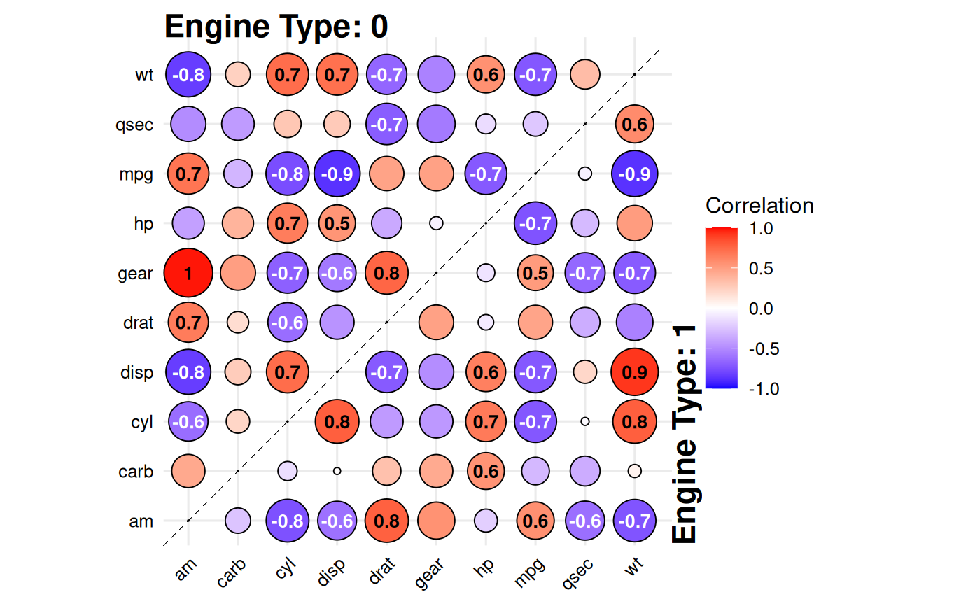
# Compare correlations between V-shaped vs straight engines
data(mtcars)

gg_splitcorr(
  data = mtcars,
  split = "vs",
  prefix = "Engine Type: "
)


# Alternative style "point"
gg_splitcorr(
  data = mtcars,
  split = "vs",
  style = "point",
  method = "spearman",
  prefix = "Engine Type: "
)
# Alternative style "point"
gg_splitcorr(
data = mtcars,
split = "vs",
style = "point",
method = "spearman",
prefix = "Engine Type: "
)